|
For
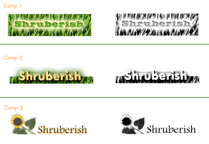
the next step of our process, we created comps to describe how to represent
Shruberish. During this step we designed logos to incorporate items that
represent Shruberish the best. From there, we selected the three logos
that we felt represent Shruberish the best.
We
chose to emphasize on landscaping and nursery for the best inspiration
on the company. To do that, we concentrated on grass and a single flower.
For
the designs themselves, we chose to make all of the logos symmetrical,
limited the negative space and used the company name as the focal point.
To do this, we put the emphasis on the wording itself.
For
color and font, we stayed with the colors and type that were called out
on the color board in the previous page. The colors consisted of mainly
green and orange hues (to create an analogous scheme) and also helped
to create a warm and calm feeling. These colors describe the company the
best (green grass, fall colors, etc). We also showed the logos in black-in-white
so that you would be able to see how they would look.
With
all that said, we feel that Comp 2 is best suited as a logo for your company.
This particular logo will be able to blend in with many other things and
used in multiple places for your company.
|
