|
For
the next step of our process, we created a color board/identity program
to describe how to represent Shruberish. During this step we gathered
the following information to represent Shruberish:
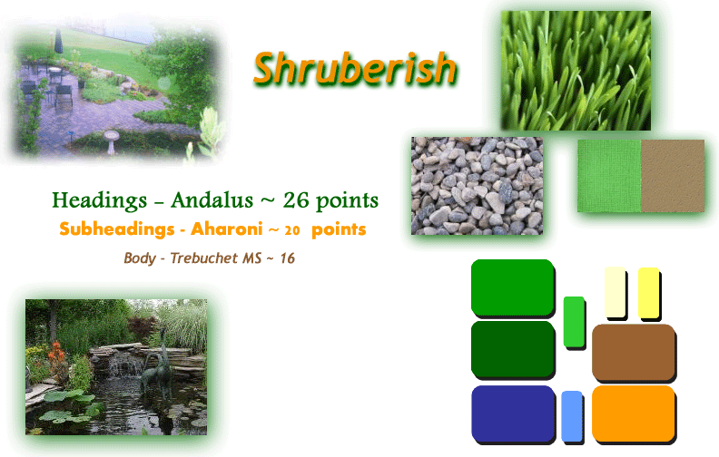
Colors
The Shruberish color palette is designed using warm colors in the color
scheme of greens, oranges and browns with some contrasting colors. These
colors would help represent your company the best. Since your services
are landscaping and nursery, the brightness of the colors help the audience
notice the vibrancy of the flowers and the greens represent the landscaping
service that you provide.
Textures and Patterns
To help with the color scheme, we chose four textures to help describe
the services; they are located on the right side of the board. The grass
once again emphasizes the landscaping services; the rocks help to emphasize
the accessories for landscaping and the water gardens. The two other textures
were used to tie them all together - they could be used as a background
texture for the website or even used as a background for mailers/advertisements
that are sent out.
Typography
When picking out the type to represent Shruberish, we choose three different
types. Andalus will be used for headings on the website and also for the
mailers/advertisements. Aharoni was mainly used when creating the logo.
This type is strong and bold like Shruberish, so it was important to make
it stand out. Trebuchert MS is a very calm looking type, we felt this
was important to use to help create that calm and relaxed feeling that
your customers will get with their finished products from your company.
This type was used a lot in the website.
Images
The two images that are located on the left side of the board were added
to emphasize the services that Shruberish provides. These images, along
with others (including flowers) will help the audience view your services
on the website.
|